

Meet the Project
Scope :
Specific Niche
Research
Problem
Findings and Objectives
Solutions and Testings
Outcomes
Future Steps
About:
Guid Me is a responsive web app designed mobile-first to help users navigate complex government and legal procedures easily and efficiently. This project was part of a hypothetical online boot camp assignment where I aimed to create a solution that fills a gap in the market.
Project Context
1. Specific Niche
This hypothetical project from an online boot camp focused on a specific niche by interpreting the brief to create a responsive, mobile-first design.
01
Around 60% of the population in Germany reported facing legal issues (By Federal Ministry of Justice )
02
Need for a friendly Digital Adoption as 81.4% of German population are social media users (DataReportal reports)
03
Goal: Connect users with mentors for guidance and reduce user frustration.
Digging for Gold
2. Research and Insights
Conducted user interviews and competitive analysis, uncovering key insights into user needs for accessible mentors, easy navigation, personalized content, and community support.
Key Questions:
For my research
What are the primary challenges users face when navigating legal systems?
What features do users prioritize in a support app, such as real-time assistance and personalized content?
How do users currently seek help, and what are the gaps in available resources?
How can we create a community that balances privacy with connectivity?
Interview questions

Interview insights

Affinity mapping

competitive analysis

I developed user personas based on the research findings. These personas guided the design decisions to ensure the app meets the specific needs and preferences of our target users.


Major Challenges
3. Problem
Users struggle with navigating complex legal systems and need an intuitive app to simplify the process, connect with mentors, and reduce frustration, thereby increasing engagement.
Aha! Moments
4. Findings and Objectives
Identified key pain points like challenging navigation and poor usability. Highlighted the need for customizing result content based on user prompts.
01
Simplify processes
02
Improve engagement
03
Offer real-time assistance.
Map it Out
I developed detailed sitemaps and content hierarchy to organize content logically and enhance user navigation.

And Finaly

Creative Fixes
5. Solutions and testings
Redesigned the interface, incorporating a search bar before registration and refining the guide search feature. Aimed to create an intuitive, user-friendly interface, validated by low-fidelity wireframes, usability testing, and before-and-after results.
Design evolution

Usability Testing
Key Points :
Registration button was not easily noticeable, benefits section was not user-friendly.
Registration text field was difficult to use
Results section layout was cluttered, distracting users from the main call to action.
Emotional Engagement
60-30-10
I applied a 60-30-10 color strategy to enhance emotional engagement, iterating based on psychological research and user feedback to reduce color messiness and improve the overall experience."

Landing page
Before and after
Moved the registration button to a prominent position and transformed the benefits section into a step-by-step guide for better usability.

Registration
Before and after
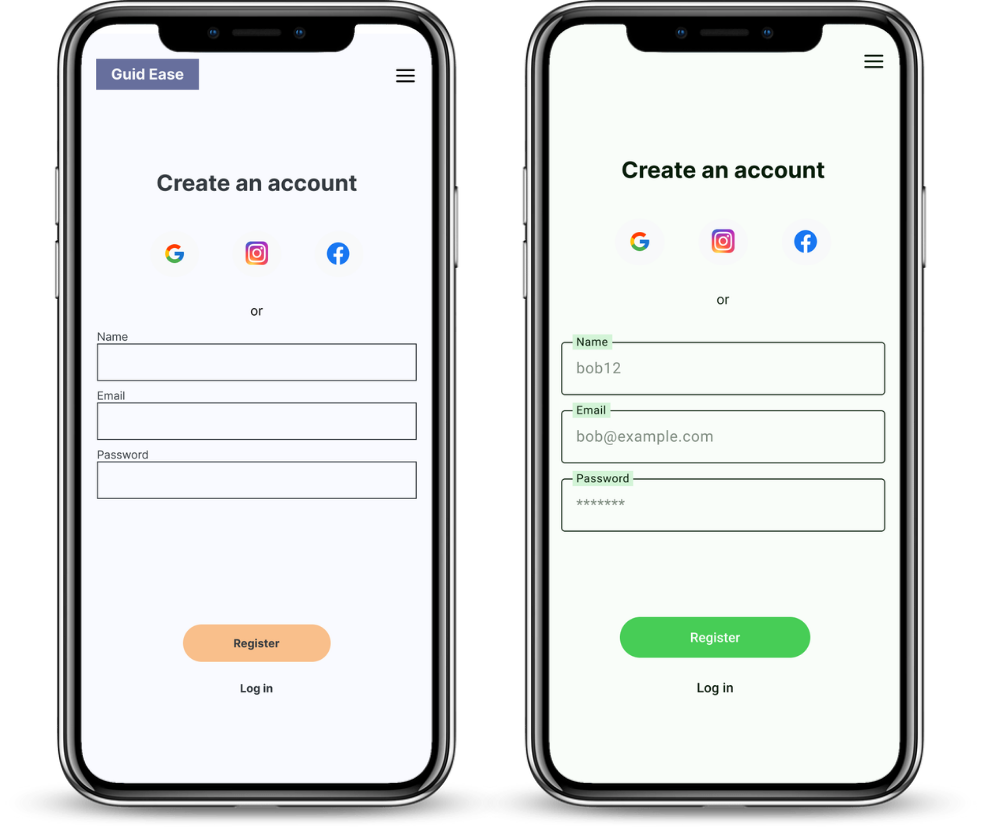
Redesigned the registration text field for improved ease of use and user-friendly experience.
Search Results
Before and after
Simplified the results section layout to create a clear call to action, minimizing distractions for users.

Menu bar
Before and after
Renamed navigation bar items for increased clarity and better user comprehension

Impact Snapshot
6. Outcomes
After the second round of testing, user satisfaction increased by 40%. 25% improvement in user interactions with highlight features. Peer reviews highlighted the importance of simplifying the navigation, which was a key learning point.
Lesson learned
7. Future Steps
I learned the importance of user-centric design and iterative testing. Next time, I would involve users earlier in the process to refine the design continuously.